As new ILLVA Saronno designer, one of the first project I dealt with, was the redesign of the second brand product of the Company: Tia Maria. The last restyling of the label was made in the 2011 by "LFH illuminating brands" an English Agency. This time instead of an external Agency, the Company decided to develop the project internally, so they give the brief to me.

The restyling invested for the first time both the label and the glass, with the idea of breaking with the past without loosing the heritage, but gaining elegance and freshness. Below you can find a complete collection of the history of the pack, from the first bottle to my last restyling. The penultimate is the one by the LFH Agency.

The storytelling of the brand dates it to the 18th century, and it's origin from a recipe given from a noble woman to her nurse Maria. The main flavor ingredients are coffee beans, Jamaican rum and vanilla. For this reason the bottle was always shaped like a small rum canteen: round, stocky and with a long neck.

The product is mainly consumed by a female target that drinks it mixed in cocktails like Tia Espresso. So both its story both its consumption has a feminine characterization: that is something to remember in the restyling.

The first step was working on the glass. The inspiration came from a bottle of beer from Parma, which struck me for its original shape, that from a square base, becomes round on his shoulders. The glass was creative, but a bit inelegant, so I played with the shape in Adobe Illustrator to create a more curvy and sexy shape.
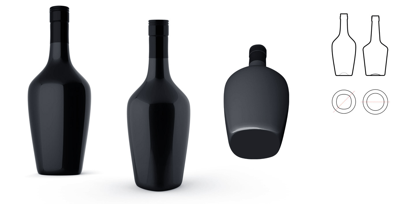
With that example, I worked jointly whit the Bormioli glassware trying to find right balance between creativity and machinability. The transition from the square base to the circular shoulder was the trickiest part. Bormioli was the key to create the actual glass, with the right glass-weight and capacity. The result is a more tall and slim bottle, more elegant and feminine and whit also a better "size impression".

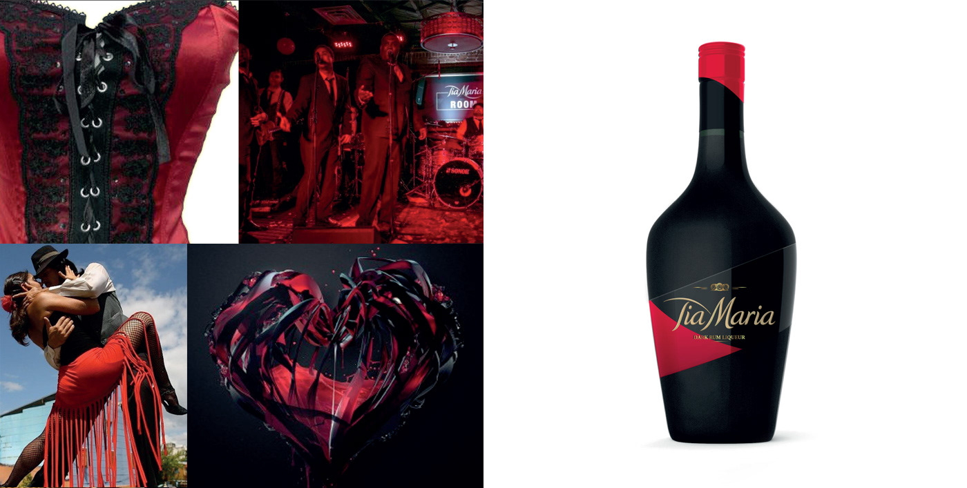
My first proposal to dress the bottle was a direct variation of the current label. The main aim was to bring the elegance and style of one of the main ingredients of the product: the Rum. For this reason I looked for inspiration in that category, identifying some key characteristics to use. The resulting idea was printing directly the logo on the bottle and make a small red label going around the base to host the legal requirements.

I made a second attempt in the Rum "world of reference". I focused more on the serigraphy tipical way of adding the brand on the Rum bottles. I twisted it using a black glossy paper instead of printing directly over the glass. In addition to the gold logo I decided to use also huge cote-of-arms violating the shape of the label. I decided to make the label runnign around the bottle, also I visualized the bottle in matte to make the label (in glosse) pop-out more.
The third option, wanted to be more graceful and feminine. The idea was to actually dress the bottle, as if the bottle was a woman, and label a corset. For this reason I made a single label that run around the glass, working both as a front and as back label. To enhance this choice, I proposed to make the glass matte and paint the label with a varnish to have a shiny label on an opaque glass.

The fourth proposal was the most disruptive one. The idea was to take two iconic elements: the coffee berry, and the Jamaican butterfly; and create a label that broke completely with the past. The old labels elements were transformed to became round and soft shapes. Three oval shapes in the color of the old label (red, burgundy and black) with the logotype in the middle. The two red ones represented the coffee berries that looked together resembled a butterfly.

The last one was a more academic restyling. The shapes of the current label were moved around and transformed into two shape overlapping. I decided to join them not in the middle of the bottle to move the visual weight to the left, and animate the total label figure which is very static compared to the other options. The main difference with the old label is the dimension. Thanks to the difficult shape of the bottle, the labeling area was very small, making the new label very thin and high. For this reason, to make the brand a bit bigger, it goes outside of the label.

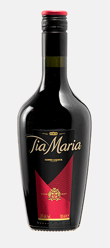
A key element to work on was the brand. The marketing idea was to focus more on the product recipe, loosing the vague "dark liqueur" in favor on a more descriptive "coffee liqueur". For the same reason I added the tree small cask, to represent the rum, the other main ingredient of the product. The last editing invested logotype: we loosed the "smile" and made the letters thinner.
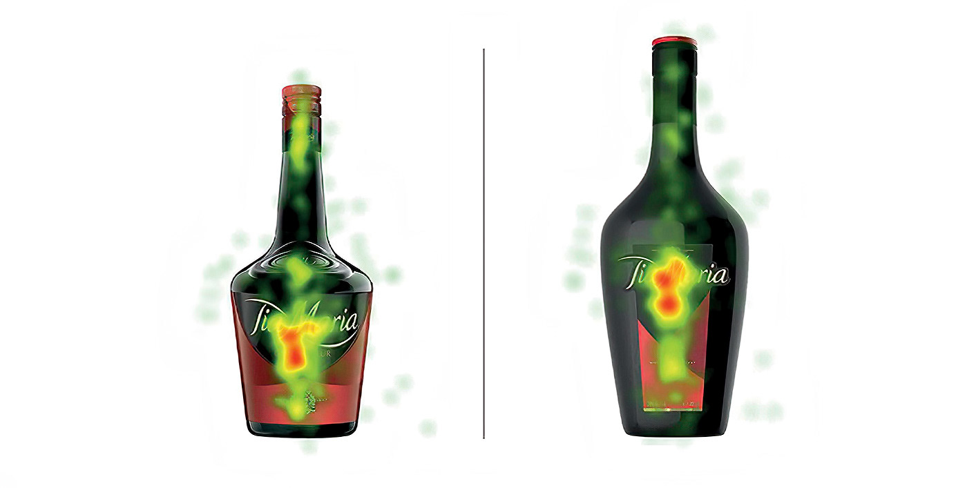
The creativity chosen was the fifth one. But before having the final approval the Company decided to make a qualitative research. Using the eye-tracking and the biofeedback we measured the recognizably and the perceptive effectiveness of the new Tia Maria pack, compared to the old pack. The eye-traking follows the eyes movement detecting the corneal reflex through the infrared allowing us to know: what a person is looking at, and how long focuses on the details. Above you can see the result of the eye-traking: the new bottle was able to focus more the attention of the consumer on the brand.

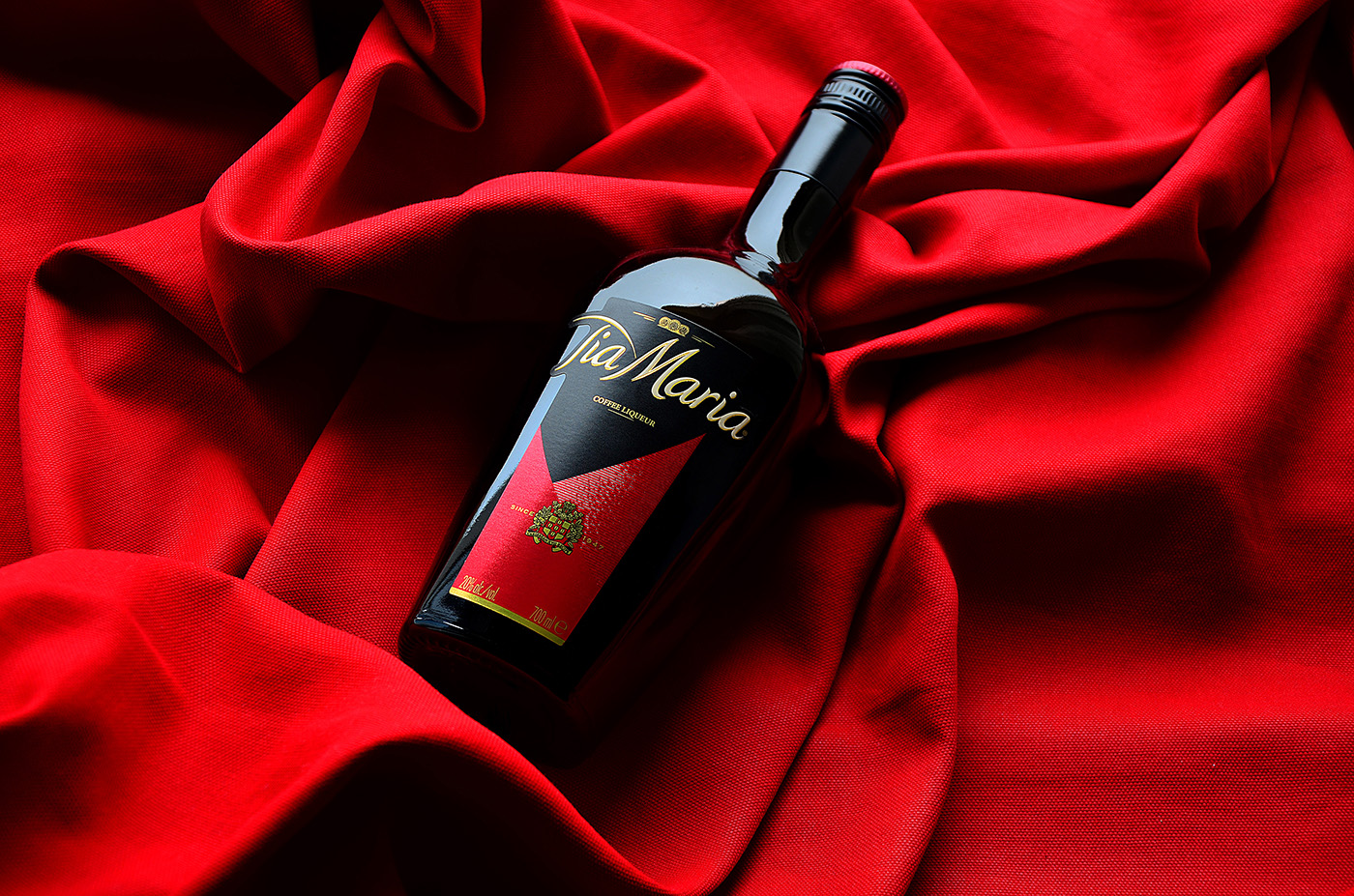
Once approved the bottle production started. The label printing was an interesting journey. I was able to experiment different varnish and finishing. Having in mind the aim of the restyling, we played with metal paper, embossing and gold.
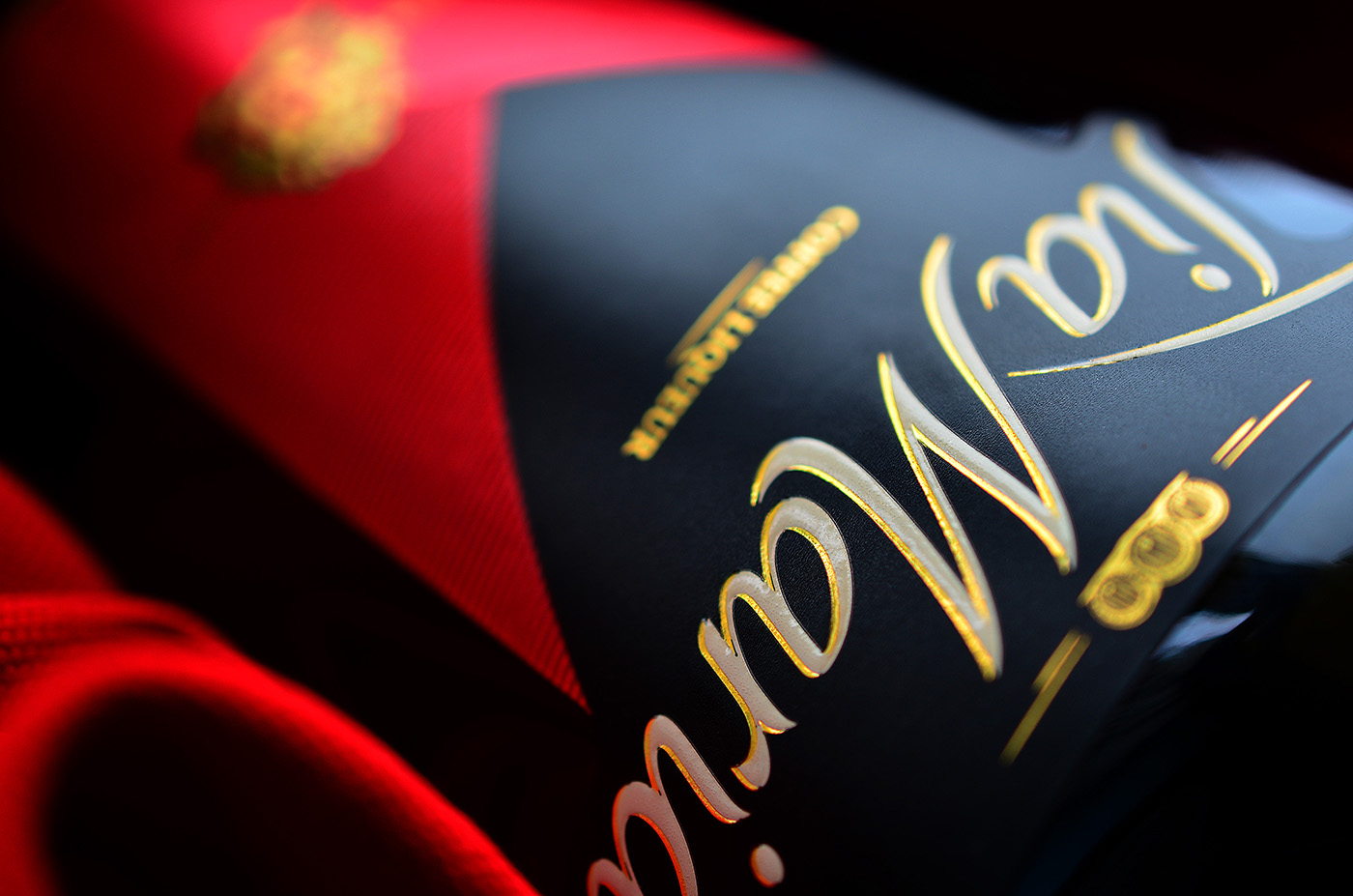


One of the goal was make the new label more three-dimensional, compared to the last one that was very flat. For this reason we made one red triangle in metallic paper and filled the other one with tin embossed lines. The cote-of-arms was also tactile, thanks to the gold finish, as the gold shadow of Tia Maria. The result is a new and graceful bottle that enhances the brand and its premium positioning.